如何輕鬆地將像素轉換為 REM、EM 和百分比
介紹
In web design, understanding and using the right measurement units is crucial for creating responsive, scalable layouts. Pixels (PX), REM, EM, and percentage (%) units are commonly used to define font sizes, spacing, and element dimensions. Choosing the right unit ensures your website looks consistent across devices.
和 工具夥伴, converting between these units is fast, accurate, and user-friendly. This guide will walk you through everything you need to know.
What Are PX, REM, EM, and % Units?
- Pixels (PX): The standard unit for digital screens, representing a single dot on the screen. Ideal for fixed elements.
- REM: Stands for “root em,” which is relative to the root font size of your website. Using REM ensures scalability and better accessibility.
- EM: Relative to the font size of the parent element. Useful for nested elements but can be tricky to calculate manually.
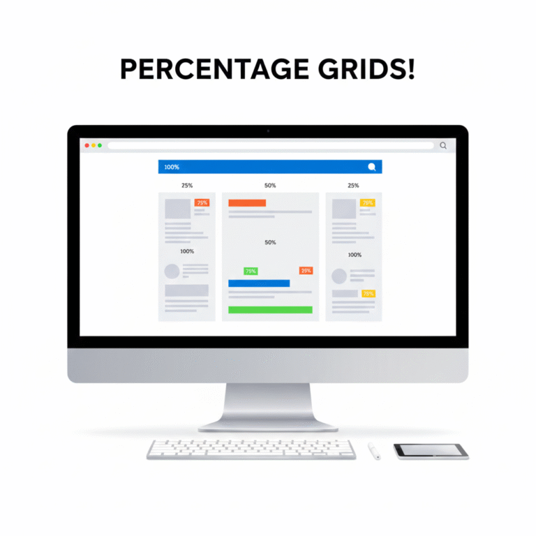
- Percentage (%): Relative to the parent container’s dimensions. Essential for responsive layouts.
Using relative units like REM, EM, or % instead of PX improves responsiveness and user experience.
How Tools Mate Simplifies Conversions
Manually calculating REM, EM, or % values can be tedious, especially for complex layouts. Tools Mate offers online PX to REM, PX to EM, and PX to % converters, letting you:
- Enter a PX value and instantly get the equivalent REM, EM, or %.
- Adjust the base font size for accurate conversions.
- Copy results directly to your CSS code.
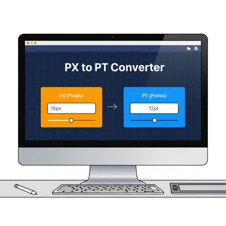
Try our PX to REM converter for a quick and accurate conversion.
逐步範例
Suppose your root font size is 16像素:
- You want to convert 24像素 to REM.
- Using Tools Mate, input 24 PX and base 16 PX.
- The tool instantly gives 1.5 REM.
Similarly, you can convert PX to EM or % in seconds without worrying about errors.
Benefits of Using Proper Units in Responsive Design
- 跨裝置的一致性: Relative units scale correctly on mobile, tablet, and desktop.
- 無障礙設施: Users with different browser settings can adjust font sizes without breaking layouts.
- 效率: Designers save time and avoid manual calculations.
For more information on responsive layouts, you can also check Mozilla’s CSS guide.
結論與行動號召
Using PX, REM, EM, and % correctly is essential for modern web design. 工具夥伴 makes these conversions fast, accurate, and reliable.
✅ Start converting your units today: PX to REM, EM, or % Converter

 Chinese
  English
  Indonesian
  Hindi
Hindi  Korean
  Portuguese
  Russian
  Vietnamese
  German
  Turkish
  French
  Spanish
  Thai
Thai  Japanese
  Arabic