網頁設計中基於百分比的佈局完全指南
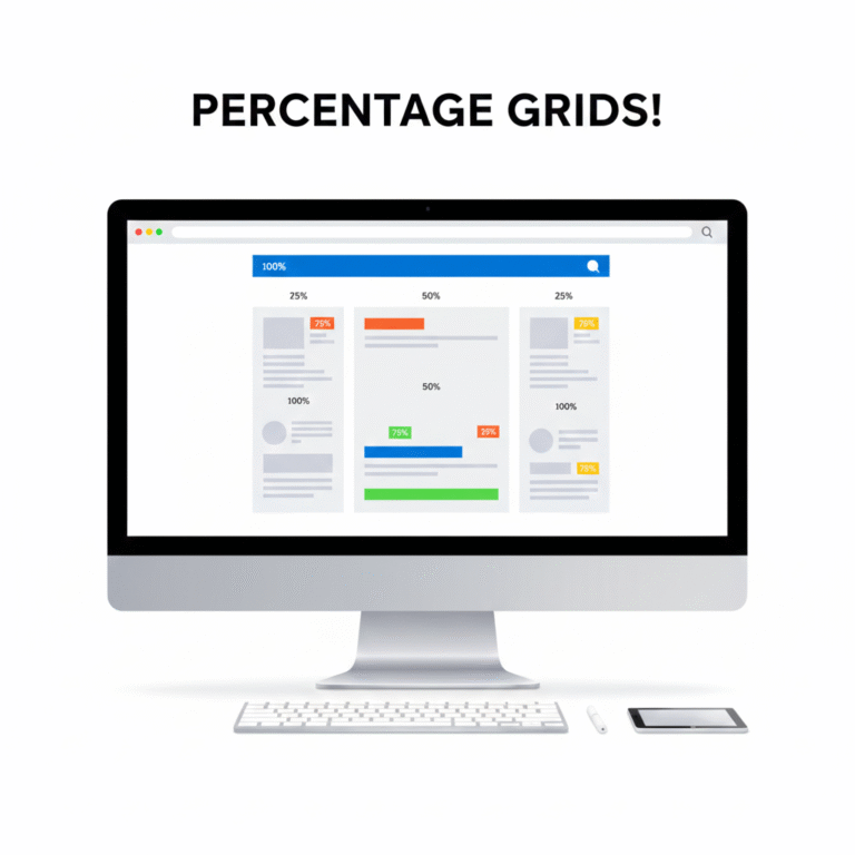
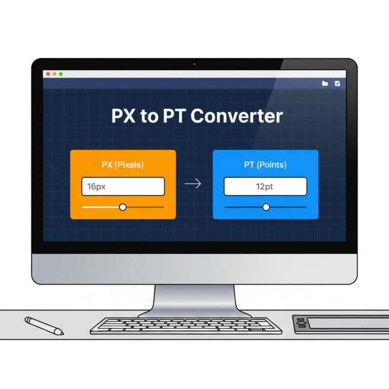
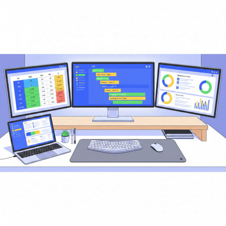
Introduction Responsive web design relies heavily on flexible layouts. Using percentage (%) units allows elements to scale relative to their parent container, ensuring consistency across devices of all sizes. With Tools Mate, converting fixed units like PX to % is simple, helping designers create fluid, adaptable layouts quickly and accurately. Why Use Percentage-Based Layouts? Fixed…

 Chinese
  English
  Indonesian
  Hindi
Hindi  Korean
  Portuguese
  Russian
  Vietnamese
  German
  Turkish
  French
  Spanish
  Thai
Thai  Japanese
  Arabic