正確理解和使用印刷和網路測量單位
引言 網頁和印刷設計都需要了解不同的計量單位。像素 (PX)、點 (PT)、公分 (CM) 和英吋 (IN) 是排版、佈局和圖形設計中常用的單位。誤用這些單位會導致設計不一致和效果不佳。 Tools Mate 提供可靠的轉換器,可以快速實現網頁和印刷單位之間的轉換…

引言 網頁和印刷設計都需要了解不同的計量單位。像素 (PX)、點 (PT)、公分 (CM) 和英吋 (IN) 是排版、佈局和圖形設計中常用的單位。誤用這些單位會導致設計不一致和效果不佳。 Tools Mate 提供可靠的轉換器,可以快速實現網頁和印刷單位之間的轉換…
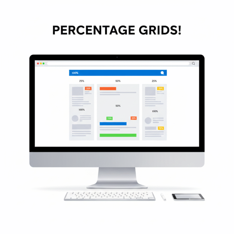
Introduction Responsive web design relies heavily on flexible layouts. Using percentage (%) units allows elements to scale relative to their parent container, ensuring consistency across devices of all sizes. With Tools Mate, converting fixed units like PX to % is simple, helping designers create fluid, adaptable layouts quickly and accurately. Why Use Percentage-Based Layouts? Fixed…

Introduction In the fast-paced world of web development and design, time is a valuable resource. Manually converting units, calculating dimensions, or adjusting layouts can eat up hours of productivity. Tools Mate is an all-in-one platform designed to streamline these tasks, allowing designers and developers to focus on creativity and problem-solving rather than tedious calculations. All-in-One…

Introduction In web and print design, accurate unit conversion is essential. Miscalculating PX, REM, EM, PT, CM, or IN can lead to inconsistent layouts, unreadable typography, and wasted time. Tools Mate helps designers convert units quickly and correctly, reducing errors and improving workflow. In this post, we highlight 5 common unit conversion mistakes and how…

簡介:建立響應式網站意味著您的佈局能夠無縫適應不同的螢幕尺寸。像素是固定單位,而視口單位(例如 VW(視口寬度)和 VH(視口高度))則允許設計師創建可擴展、靈活的設計。 Tools Mate 提供便利的轉換工具和指南,幫助設計師快速且準確地計算視口單位。什麼是 VW…
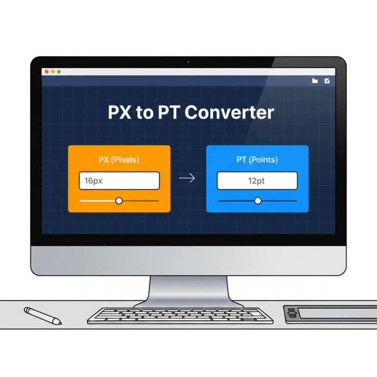
引言 在網頁和印刷設計中,像素 (PX) 和點 (PT) 是排版和佈局中最常用的兩種單位。對這些單位的誤解或計算錯誤會導致文字大小不一致、設計縮放效果不佳以及糟糕的使用者體驗。 PX 到 PT 轉換器對於希望獲得精確轉換的設計師來說是必不可少的工具…

引言 精確測量對於網頁設計和印刷專案都至關重要。使用錯誤的單位會導致佈局錯位、影像模糊或尺寸不一致。設計師經常使用公分 (CM)、毫米 (MM) 和英吋 (IN),但手動轉換這些單位既繁瑣又容易出錯。使用 Tools Mate,您可以即時轉換 CM、MM 等單位…
引言 在網頁設計中,理解並使用正確的計量單位對於建立響應式、可擴展的佈局至關重要。像素 (PX)、REM、EM 和百分比 (%) 單位常用於定義字體大小、間距和元素尺寸。選擇正確的單位可確保您的網站在不同裝置上呈現一致的效果。使用 Tools Mate,您可以輕鬆地在這些單位之間進行轉換…
 Chinese
  English
  Indonesian
  Hindi
Hindi  Korean
  Portuguese
  Russian
  Vietnamese
  German
  Turkish
  French
  Spanish
  Thai
Thai  Japanese
  Arabic