Cómo utilizar unidades VW y VH para un diseño web adaptable
Introducción
Creating a responsive website means your layout adjusts seamlessly across different screen sizes. While pixels are fixed units, viewport-based units like VW (viewport width) and VH (viewport height) allow designers to create scalable, flexible designs.
Herramientas Mate offers easy conversions and guides to help designers calculate viewport units quickly and accurately.
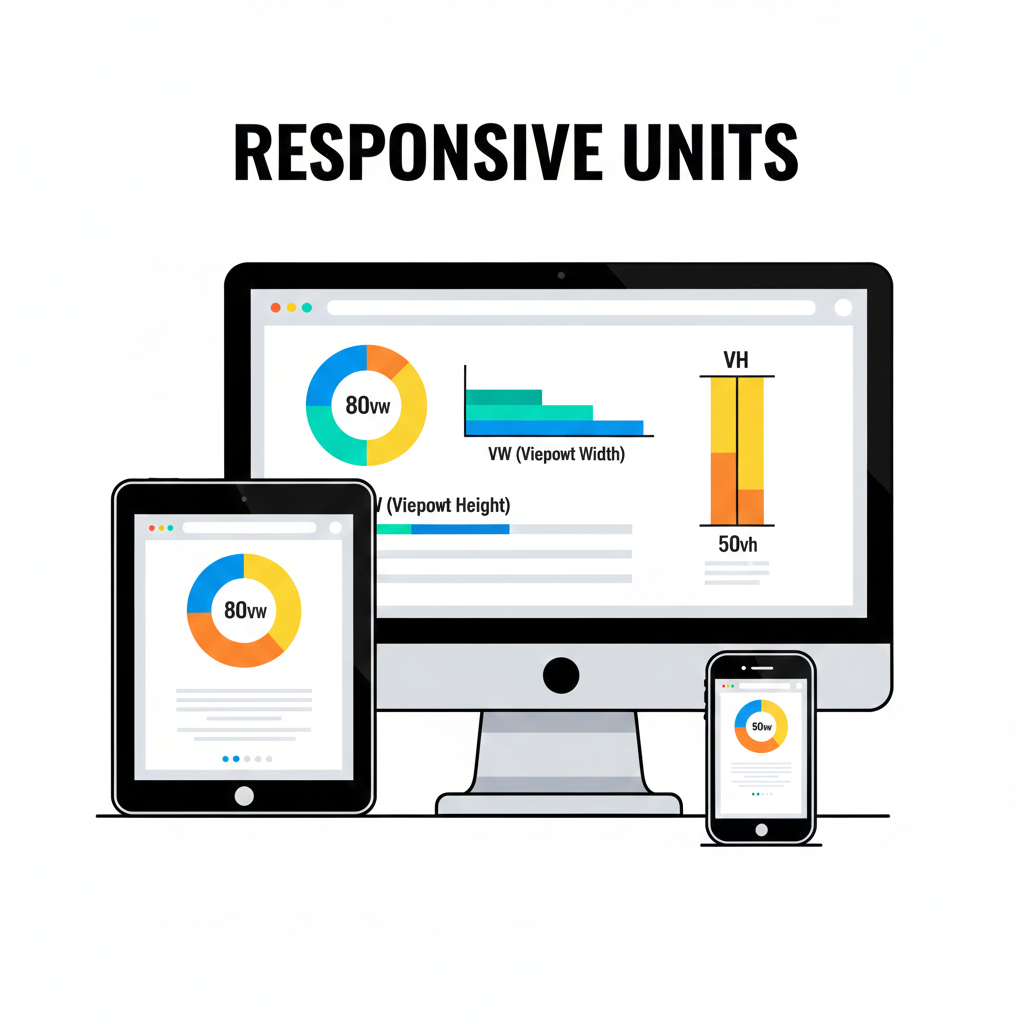
What Are VW and VH Units?
- VW (Viewport Width): 1 VW equals 1% of the viewport’s width. Ideal for scaling widths and typography based on screen size.
- VH (Altura de la ventana gráfica): 1 VH equals 1% of the viewport’s height. Useful for height-based elements, hero sections, and full-screen layouts.
Using VW and VH ensures your website adapts beautifully to desktops, tablets, and mobile devices without breaking layouts.
Cómo ayuda Tools Mate
Calculating exact VW and VH values manually can be confusing. Tools Mate simplifies the process:
- Convert fixed PX values into VW or VH instantly.
- Adjust designs based on different screen sizes.
- Copy results directly into CSS for faster workflow.
Try our PX to VW/VH converter and make your layouts fully responsive.
Ejemplo paso a paso
Suppose you have a hero section with a width of 960px on a 1920px wide screen:
- Aporte
960 PXand screen width1920 PXin Tools Mate. - The converter outputs
50 VW. - Apply
width: 50vw;in your CSS to make the element responsive.
Similarly, you can calculate height using VH to create full-screen sections without guesswork.
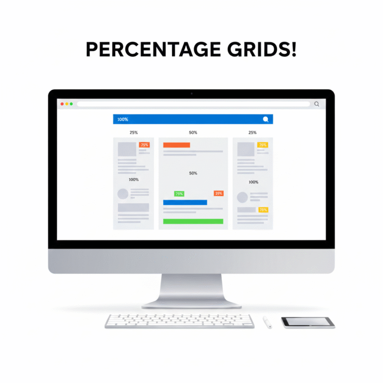
Benefits of Using VW and VH
- Diseño responsivo: Elements scale proportionally on any device.
- Improved UX: Maintains layout consistency across desktop, tablet, and mobile.
- Eficiencia: Eliminates manual trial-and-error adjustments for screen sizes.
For more tips on responsive web design, check out W3Schools CSS Units.
Conclusión y llamada a la acción
VW and VH units are powerful tools for modern web design. Herramientas Mate makes conversions simple and accurate, helping you create websites that look perfect on every device.
✅ Start converting PX to VW/VH now: PX to VW/VH Converter
 Spanish
  English
  Indonesian
  Hindi
Hindi  Korean
  Portuguese
  Russian
  Vietnamese
  German
  Turkish
  French
  Thai
Thai  Japanese
  Arabic
  Chinese