
Understanding and Using Print and Web Measurement Units Correctly
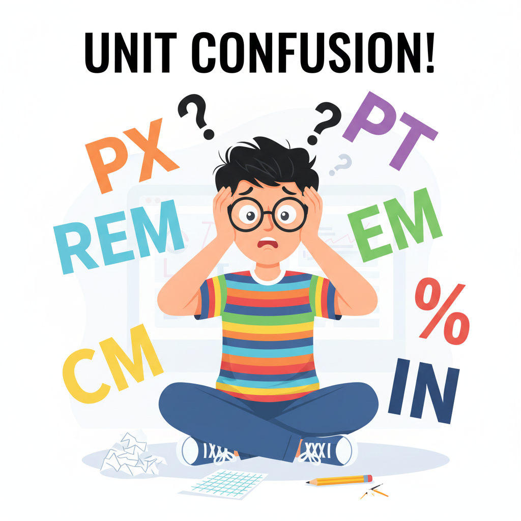
Introduction Designing for both web and print requires understanding different measurement units. Pixels (PX), points (PT), centimeters (CM), and inches (IN) are common units used in typography, layouts, and graphics…

The Complete Guide to Percentage-Based Layouts in Web Design
Introduction Responsive web design relies heavily on flexible layouts. Using percentage (%) units allows elements to scale relative to their parent container, ensuring consistency across devices of all sizes. With…

How Tools Mate Saves Time for Web Developers and Designers
Introduction In the fast-paced world of web development and design, time is a valuable resource. Manually converting units, calculating dimensions, or adjusting layouts can eat up hours of productivity. Tools…
5 Common Unit Conversion Mistakes Designers Make and How to Avoid Them
Introduction In web and print design, accurate unit conversion is essential. Miscalculating PX, REM, EM, PT, CM, or IN can lead to inconsistent layouts, unreadable typography, and wasted time. Tools…
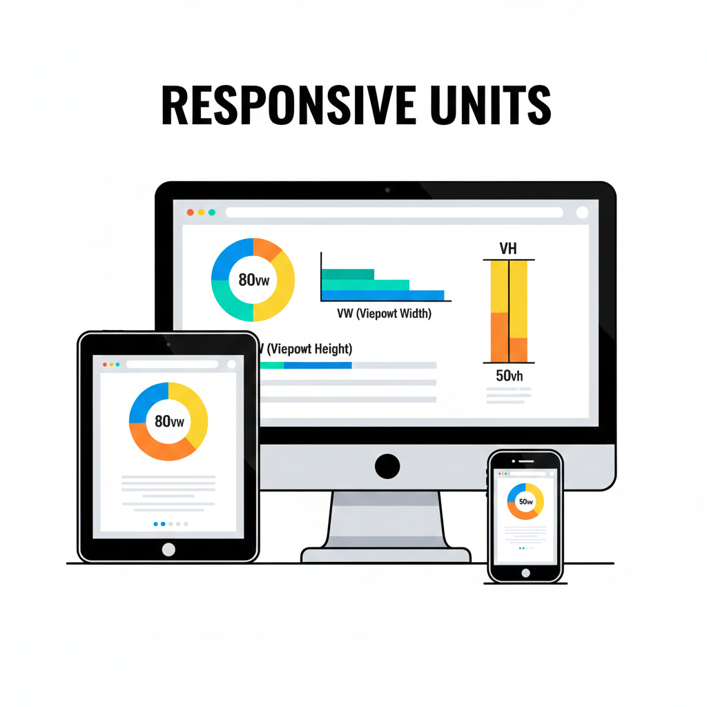
How to Use VW and VH Units for Responsive Web Design
Introduction Creating a responsive website means your layout adjusts seamlessly across different screen sizes. While pixels are fixed units, viewport-based units like VW (viewport width) and VH (viewport height) allow…

Why Every Web Designer Needs a Reliable PX to PT Converter
Introduction In web and print design, pixels (PX) and points (PT) are two of the most common units for typography and layout. Misunderstanding or miscalculating these units can lead to…
Contents
- 1 Understanding and Using Print and Web Measurement Units Correctly
- 2 The Complete Guide to Percentage-Based Layouts in Web Design
- 3 How Tools Mate Saves Time for Web Developers and Designers
- 4 5 Common Unit Conversion Mistakes Designers Make and How to Avoid Them
- 5 How to Use VW and VH Units for Responsive Web Design
- 6 Why Every Web Designer Needs a Reliable PX to PT Converter
- 7 Posts pagination
 English
  Indonesian
  Hindi
Hindi  Korean
  Portuguese
  Russian
  Vietnamese
  German
  Turkish
  French
  Spanish
  Thai
Thai  Japanese
  Arabic
  Chinese