How to Convert Pixels to REM, EM, and Percent Easily
Introduction
In web design, understanding and using the right measurement units is crucial for creating responsive, scalable layouts. Pixels (PX), REM, EM, and percentage (%) units are commonly used to define font sizes, spacing, and element dimensions. Choosing the right unit ensures your website looks consistent across devices.
With Tools Mate, converting between these units is fast, accurate, and user-friendly. This guide will walk you through everything you need to know.
What Are PX, REM, EM, and % Units?
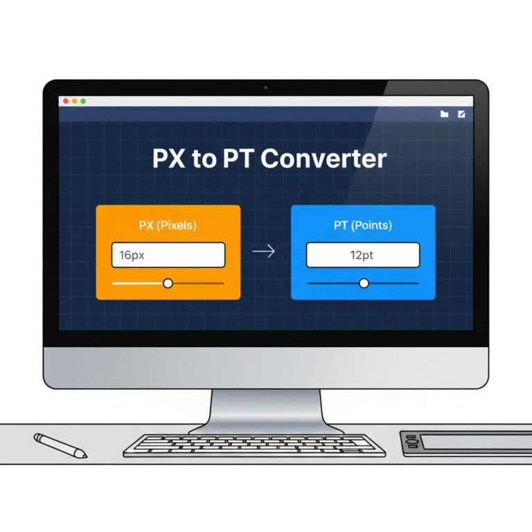
- Pixels (PX): The standard unit for digital screens, representing a single dot on the screen. Ideal for fixed elements.
- REM: Stands for “root em,” which is relative to the root font size of your website. Using REM ensures scalability and better accessibility.
- EM: Relative to the font size of the parent element. Useful for nested elements but can be tricky to calculate manually.
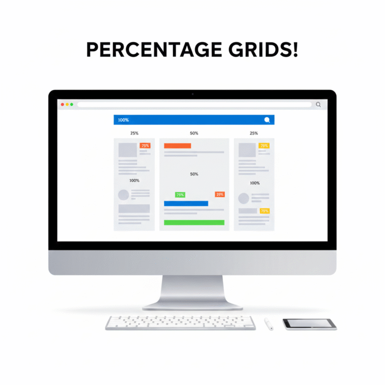
- Percentage (%): Relative to the parent container’s dimensions. Essential for responsive layouts.
Using relative units like REM, EM, or % instead of PX improves responsiveness and user experience.
How Tools Mate Simplifies Conversions
Manually calculating REM, EM, or % values can be tedious, especially for complex layouts. Tools Mate offers online PX to REM, PX to EM, and PX to % converters, letting you:
- Enter a PX value and instantly get the equivalent REM, EM, or %.
- Adjust the base font size for accurate conversions.
- Copy results directly to your CSS code.
Try our PX to REM converter for a quick and accurate conversion.
Step-by-Step Example
Suppose your root font size is 16px:
- You want to convert 24px to REM.
- Using Tools Mate, input 24 PX and base 16 PX.
- The tool instantly gives 1.5 REM.
Similarly, you can convert PX to EM or % in seconds without worrying about errors.
Benefits of Using Proper Units in Responsive Design
- Consistency Across Devices: Relative units scale correctly on mobile, tablet, and desktop.
- Accessibility: Users with different browser settings can adjust font sizes without breaking layouts.
- Efficiency: Designers save time and avoid manual calculations.
For more information on responsive layouts, you can also check Mozilla’s CSS guide.
Conclusion & Call-to-Action
Using PX, REM, EM, and % correctly is essential for modern web design. Tools Mate makes these conversions fast, accurate, and reliable.
✅ Start converting your units today: PX to REM, EM, or % Converter

 English
  Indonesian
  Hindi
Hindi  Korean
  Portuguese
  Russian
  Vietnamese
  German
  Turkish
  French
  Spanish
  Thai
Thai  Japanese
  Arabic
  Chinese